makers mark help (again!)

Dreadhead

Bushcrafter through and through
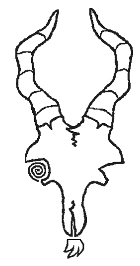
well im not altogether sure. i think the goat head is a great sigil and looks great when hand carved large but its still too big for a makers mark. try fitting that design onto a 2 pence peice; all the detail gets smudged up. i need something very simplified to fit a 2 pence peice. a smaller simplified goat skull may work (the spiral idea inside was a nice touch!), and i like the other ideas using the goat prints and foot prints. the simple combined runes are nice and simple but im not as keen as the runes end up pretty skewed.

im a fussy ole goat i know! its hard to convey the images in my head of goat skulls, spirals, runes, and goat prints. im most likely asking for too much and missing the simpler picture
 

wickedwillow

Member
Dec 29, 2010
35
0
malvern
Valknut every time, after all you've had quite a lot of practice doing it, may be explode it out a bit or use the drinking horns rolling.
 

Dreadhead

Bushcrafter through and through
Yeah Steve i thought the valknut as it works with my last name and is a great design. but its a symbol used all over the world so i would need to personalise it somehow with the goat aspect which i have no idea how to do. i thought maybe a small valknut with two goat prints in the background but i have no idea how to draw that!
 

greensurfingbear

Bushcrafter (boy, I've got a lot to say!)
yeah it helps if I attach the image...... ok its more triskele than valknut but you get the idea :D

8uzeda8a.jpg


quickly whipped this up using a goat head icon I found on line. I would recommend making some changes to the heads so you don't get done for copyright lol

Orric
 
Last edited:

Angst

Full Member
Apr 15, 2010
1,927
3
52
Hampshire
www.facebook.com
careful guys....next he'll be getting you to do his leatherwork whilst he sits back and suns it on his boat!....he's training you up in his style!!!! very clever m8! lololol

seriously though....i like the goat with the wonky eye....very slaine beserker looking m8.

and sorry i've been so quiet recently....as you know, loads goin on....but i have been checkin ya stuff out m8...LOVELY!

s
 

grey-array

Full Member
Feb 14, 2012
1,067
4
The Netherlands
Hey Hamish,
did some work on your behalf ^^
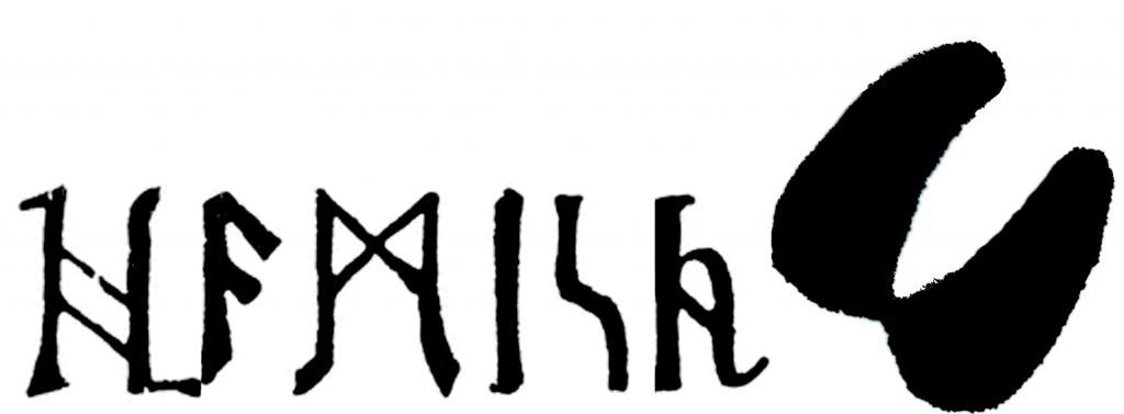
Here's what I came up with to keep it small and easy.
Hamishrunicoffset.jpg

Hamishtraillogobw.jpg

Say what you like, and perhaps I can further develop it into something you're looking for
perhaps overlapping the hoof over part of the runic script? or make the script less long
Yours sincerely Ruud
 

Attachments

  • Hamishrunicoffset.jpg
    Hamishrunicoffset.jpg
    13.7 KB · Views: 6

Dreadhead

Bushcrafter through and through
phwaw lovin the creativity coming out here!

Orric, i like the triskele idea but as you lifted that design from google your right maybe not a great idea with the copyright! swmbo says im a scruffy toggenburg goat wheras that looks more like a ram or ibex harharhar

cheers Sonni tis strange not seeing you posting up new stuff! if i was good with pen and paper id be doing this myself but its one of those things im lacking in

Ruud you get my style mate lovin those designs. i like the idea of my name with a goat hoof, maybe in norse runes running through a hoof print that might work? OR the outline of a goat hoof print with an H and a G in each half in runes? aarg im liking this idea may try and knock up a crappy version myself to show what i mean!
 

Dreadhead

Bushcrafter through and through
here is what i meant with the letters in the hoof. its done really badly a crappy outline with some letters added in. if it was designed a little more pleasing on the eye it may be the ticket

hoof2.jpg


or

hoof3.jpg


i think the letters look better as its easier to tell what they mean
 

grey-array

Full Member
Feb 14, 2012
1,067
4
The Netherlands
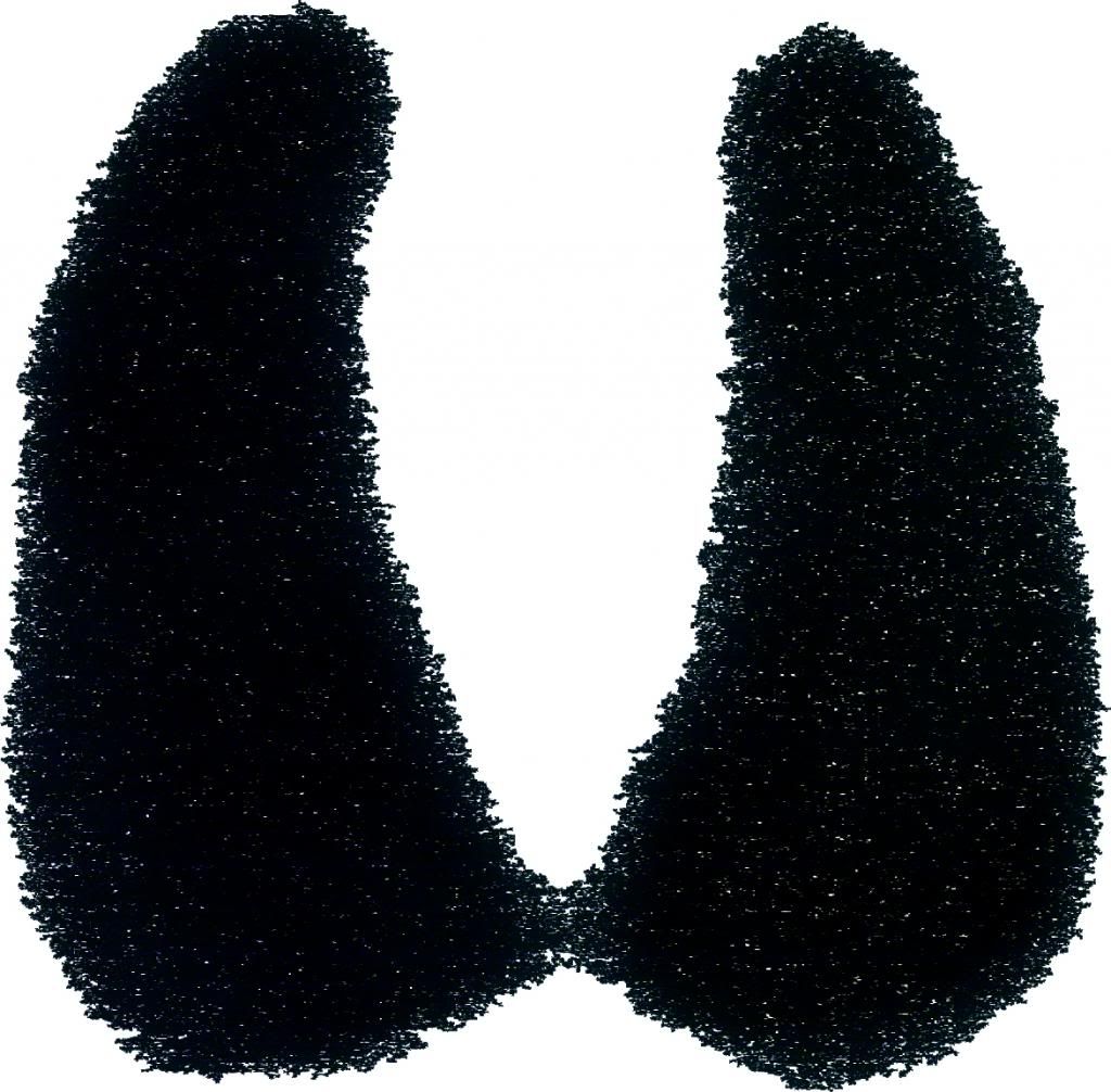
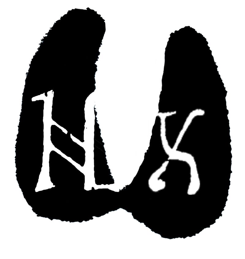
If you'd go for a stamp, I 'd go for some solid hooves, with the letters cut out so you see the lettering in the higher part, instead of in the depression of the leather.
....... Computing......... analyzing....... creating/editing

initialsinside.jpg


And okay perhaps swap that to normal lettering
So a g instead of an X
Yours sincerely Ruud
 

Dreadhead

Bushcrafter through and through
Superb Ruud! yeah if H is a little more centre inside the hoof so it stands out better with a G instead of the X and it would be perfect!. any way you could sort that out? your design skills are top notch mate especially as your working wth my fussy imagination:lmao: ill have to come up with a prize for you ;)
 

greensurfingbear

Bushcrafter (boy, I've got a lot to say!)
Orric, i like the triskele idea but as you lifted that design from google your right maybe not a great idea with the copyright! swmbo says im a scruffy toggenburg goat wheras that looks more like a ram or ibex harharhar!

The goat was an icon for capricorn star sign not sure which species of goat that is Capra Astra maybe lol.

Goat hooves with runes in is simpler mind and fits your brief brief better I think :D come on lets see a finished design Ruud lol


Orric
 

Sparrowhawk

Full Member
Sep 8, 2010
214
0
Huddersfield
Hello mate.
I love your original image, it's so personal and unique, says everything you need it to say. I've simplified it a tiny bit in paint, but this should translate into a great leather stamp. Add initials if you want, but the image is so unique that I don't think it's necessary.
ATB,

Josh H

Goat.png
 

BCUK Shop

We have a a number of knives, T-Shirts and other items for sale.

SHOP HERE