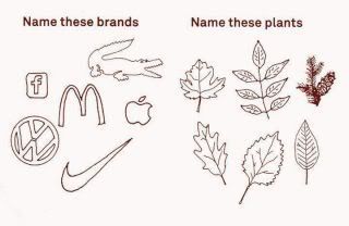
Well as a graphic designer maybe I should steer well clear of this discussion but her goes. The fact that the logos have become so ingrained in our lives is that they are passively in twined with our day to day happenings. They have been designed to stand out form the rest and in a crowded market place. Brands go to great lengths to ensure that their logo is put in front of people in a consistent way, by that I mean there will be no iregularities on proportion or colour. They also go to great lengths to protect their logos from being copied to retain their 'individualism'. The fact that they are seen so many times a day via different medias (press, tv, Internet, street media and frontage) they become instantly recognised and, to some part, desirable. Not so sure that maybe some lesser sort after brands would be so easy to identify drawn a little crudely. In short a well designed logo does in deed become the face and personality of a brand. Think of a situation where you've been in a group of people. Which are the faces you remember and why. Did they stand out from the rest for some reason?
Now to turn to the leaf, kind of the antipathy of a logo really. They are not consistent in size, proportion or colour. They are not designed to be seen on their own and standout from every other leaf around them and every single one is individual. To confuse the issue more, there are similar brands or families if you will, with similar characteristics. Consider if all burger chains had to use an uppercase yellow m ( i could go on adding the constraints, but that would just show how geeky i am) we would have trouble identifying one from another. Having spent some years working with both McD's and Coke, im sad enough to pretty much match the change in logo to the year. But when it comes to leaves, I only know the ones I think I know because I have sought the knowledge. I'm positive that I could, if I exposed myself to them as often as other brands, quickly know many of them. If they had a specific use to me, I'm sure they would be more quickly absorbed into my knowledge base.
If you've made it this far, congratulations, not sure that has answered anything or just posed how people like me influence the unsuspecting public into doing what we want them too.


")